
Sunday Summary: How to Get a Good Composition
Read about my approaches to getting a good composition in drawings, paintings, photographs and music. We have also launched our first weekly challenge which you are invited to participate in!
Weekly Summary
Hello Readers!
Well, another week has passed and here in the UK, the mercury is climbing and Summer is well and truly in full swing. Even my friend Hayley won’t be able to complain with predicted temperatures of over the next week sitting at 25 degrees minimum (that’s celsius for those reading across the pond).
Nicer weather will draw many of us outside, and for me, one of the joys I have in life is to just sit outside and take in all the sounds, lights, movement and shapes. I find it grounding to just be near a tree and hearing the rustling of the leaves as the wind blows, or looking up into the clouds and observing the way light passes through them, spotting any shapes, just as many of us probably did when we were children.
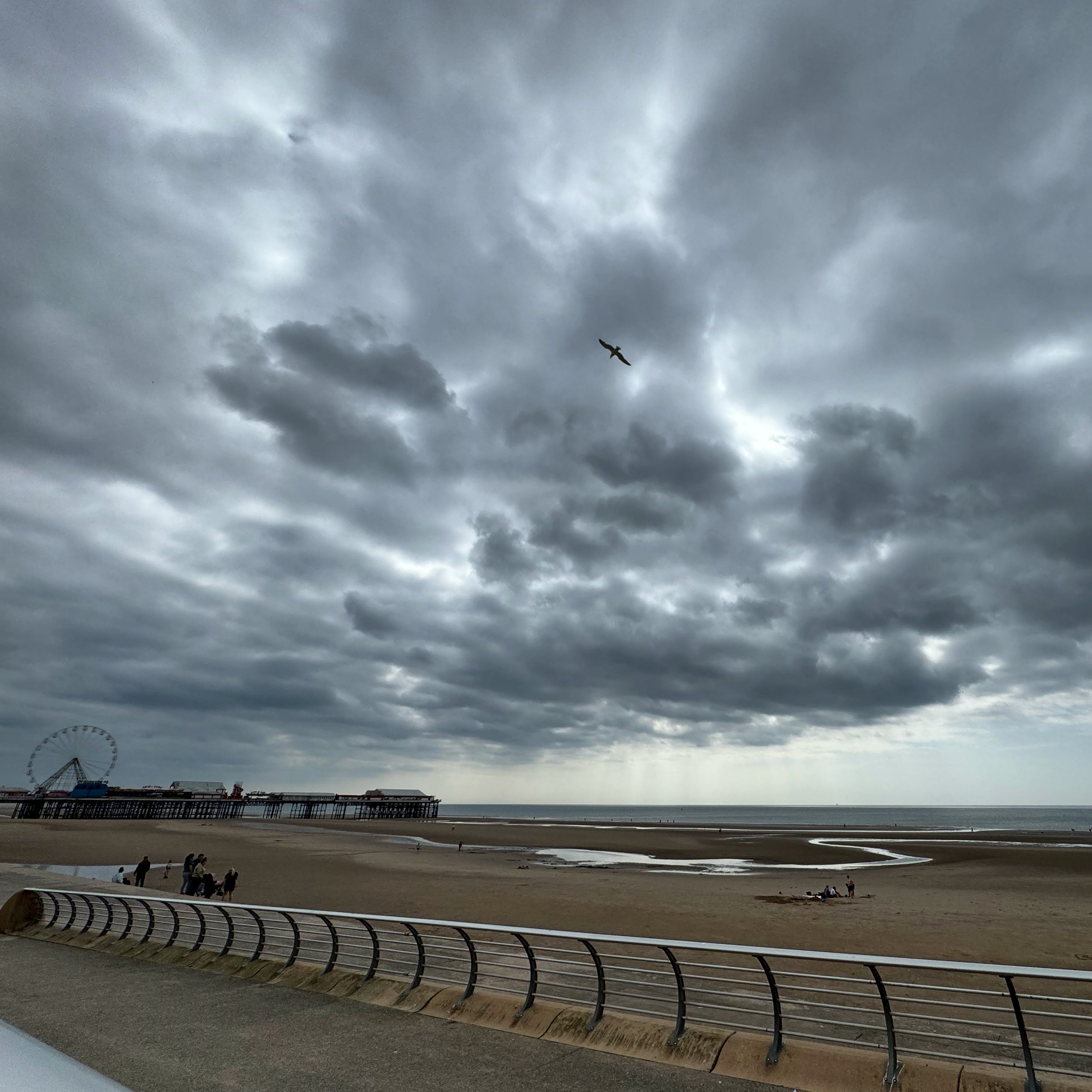
Foreboding clouds at Blackpool making an atmospheric photo. May 2024
The thing is, from an artistic perspective, while full sunshine and cloudless skies are great for getting a top up for Vitamin D, an empty sky doesn't always make the most interesting pictures. Contrasting tones help give a sense of form, and a strong composition can help give perspective and interest, preventing what can otherwise be a flat picture.
Considering the above, I thought I would focus this week on how I go about making a good picture, focusing on composition and launching our first weekly challenge.
What is Composition?
Composition is a word that is applied in many contexts. But what does it mean when we talk about composition in art, photography, or even music?
When talking about composition, we are considering the main elements that are within an image, song, or a body of work. In the context of a picture, they are the key components that the picture will have and how those elements or components are arranged.

Trondheim, November 2024
To help give some context, above is a photograph that I took from my visit to Trondheim last November. If we were to analyse the photograph and consider what the key elements are, and their positioning, there are probably only a handful of key elements. For me, these are,
Where the horizon sits, about a third of the way up.
The diagonal row of the old and colourful timber warehouses
The river in the foreground
The reflection of the warehouses in the river, highlighting how still the water is
The subtle blue tones in both the skies and water indicating the fading northern light.
The church and hill in the background helping to give a sense of distance and slightly breaking up the line of roofs on the warehouses.
If one of the above were to be taken out, or changed in anyway, then it is likely the the whole feeling of the photograph would be very different and so are the key elements; the composition.
What Makes a Good Composition?
This is a topic that could be debated, and debated, and debated; everyone will have their own opinion. However, there are some points to consider that in most instances will give you a solid framework to your picture.
Intention
When you get out to capture a moment, you are often trying to convey something; this is your intention. A good piece of art will always have an intention that it’s Creator is trying to put across to the audience. Without it, your piece will lack intention and for me, you will get into difficulty before you have even started. Intention does not have to be contrived. You don’t have to have some elaborate explanation. Sometimes it can just be a study, to capture a special moment, or in the case of my Trondheim picture, evidence of a life long ambition to visit ever since learning about the Vikings as a child.
A Focal Point
Once you have decided on your intention, the next thing to consider is having a strong focal point. This is as much to do with how our brains process images as much as it is about artistic intention. A strong focal point will give the eye something to focus and determines how our eyes will initially navigate through the picture; It is the show stoppers of the piece! It can also support other important factors within a composition such as where to place your horizon. Too many focal points can create a very busy picture, which is fine if that is your intention, but can make pieces difficult to access for some people.
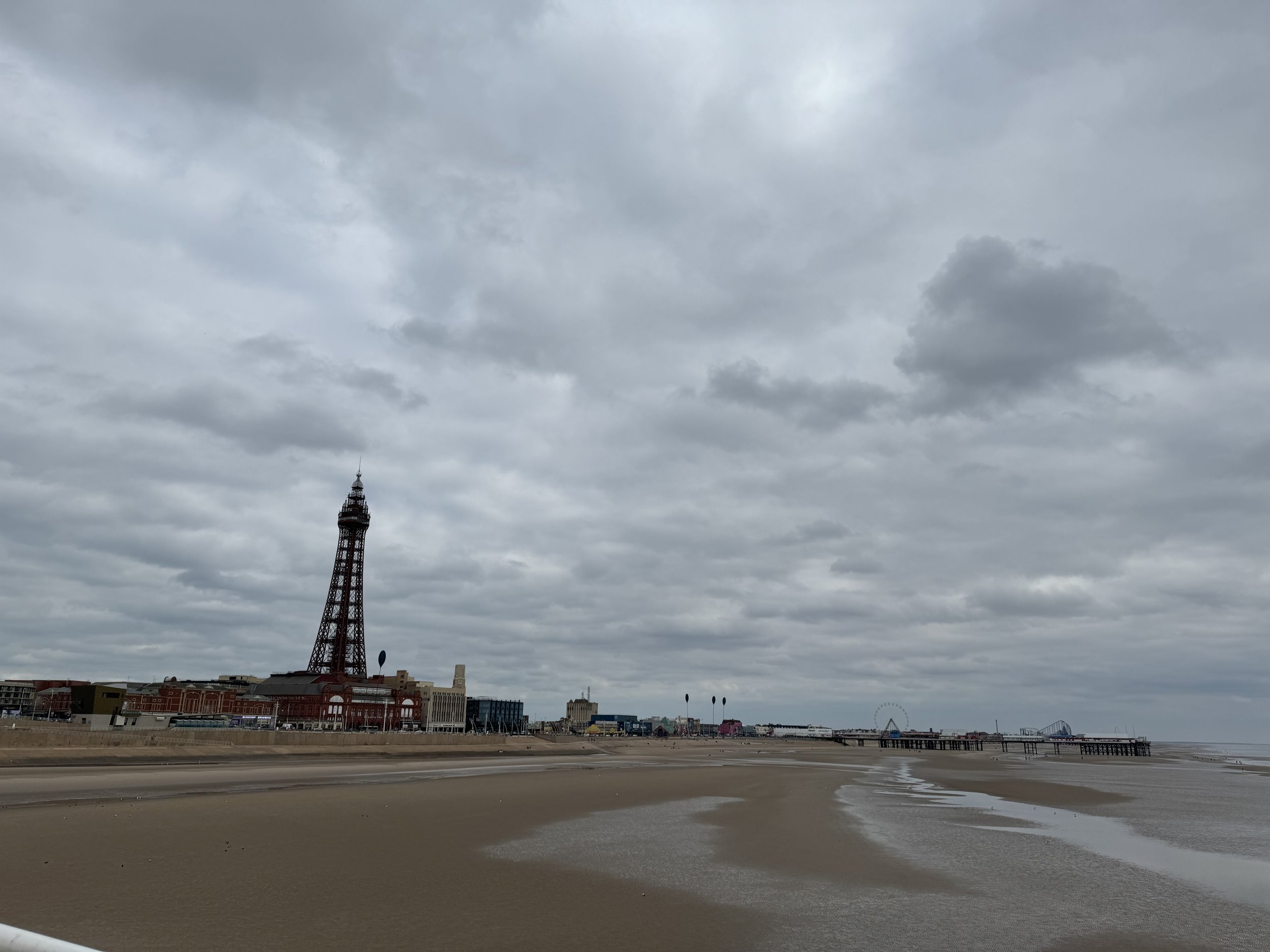
Not an inspiring picture, with the above picture having very little in it; grey tones, limited light, altogether very flat. However, there is a focal point, in this instance, the Blackpool Tower. It not only enables the the viewer to recognise the location, but probably the first thing your eyes focused on and in doing so, immediately immerse yourself into the picture.
The Thirds Model (and perspective)
For me, this is the thing that I probably lean on the most as it It can help make even the most challenging of landscapes easier to access. There is probably some scientific explanation as to why this works, but I shalln’t bore you in what is already a longer than average blog.
The principle is simple. When deciding on your composition it can be very helpful to imagine lines across the aspect, splitting it into three equal thirds horizontally and three equal thirds vertically. One of the horizontal lines will become your horizon, and the vertical lines helping to determine the placing of the focal points as well as making perspective easier.

Using a picture I took from a recent trip to Paris, I have separated the picture using white lines for the vertical thirds and purple lines for the horizon lines. You can see the horizon is mainly occupying the first third, which shows that the objects and focal points are nearer, but also creating less noise as a higher horizon would mean that something nearer to would likely be the focal point, such as a boat on the river and with more reflecting light on the water. Using the vertical line, the initial focal point of the dome is in the left third with the Eiffel Tower in the right third further back, helping to then create a sense of distance, or perspective, with the row of buildings getting smaller the closer they are to the Tower. If we were to draw a line, we would then have a thinly wedged triangle. All together, we have a relatively balanced picture of the Parisian night.
Light and Tone
My final go to crutch, which for me also helps create the style of my pictures is the observation of the light and tonal qualities within a picture. For me, they come together hand in hand; they are each other’s composition companions.
Every good composition must consider where the light is coming from. This will decide where the highlights and shadows will be placed in your picture creating depth and a more 3 dimensional picture. The type of light will also determine the tonal qualities of your picture. Full on light will create bold tones where as a sun low in winter may create more blue or grey tones.
When it comes to considering tone in your picture, having a consistent tonal quality will help create balance, even when a picture may be challenging to capture, because for example, a picture lacks a focal point because you are in some desolate barren landscape. Tonal quality of the colours can also help convey other things like the time of day, the time of year or the weather.
Whether you are a traditional landscape artist, minimalist, or an abstract painter, if you don’t have consistent tones within a picture, you can risk having a picture that the viewer may find quite jarring. However, this is not always true as focusing on something that has more bold colours, if the rest of the painting is in pastel for example, can help create a focal point, especially if the picture is busy such as a city scape.

In the above picture, the low winter’s sun behind the clouds restricts the light to the central proportion of the picture. The tonal qualities are muted, with mostly silver and greys. However, the lack of light is creating a more contrasting and dominant tone in the foreground on the tidal breakers. This contrast in tones help create additional focal points, in this instance, the tidal breaker, leading the viewer around the picture and making the composition more interesting.
Weekly Challenge - Over to you!
I hope you find these key takeaways on composition useful. It would be great to see you use them yourselves over the next week and so over the course of the next week, I challenge you all to use these basic tips to capture a picture.
If you post your pictures onto either Facebook or Instagram, and use the hastag #p&pchallenge and tag me in, then the best picture on Facebook and Instagram will each get a free mug with one of my pictures on it sent to their address and will feature in the next blog.
Be bold, have a go!
Weekly Song
Well I am going to keep this short because a lot has been covered this week.
Sticking to the theme of sunny days to come, light, skies and hopefully some upbeat days, I have chosen a song for me that resonates when collectively considering the above themes. I hope you enjoy it.
Summary
Well, that was a packed blog this week. I hope you enjoyed it. If you enjoyed this week’s blog feel free to comment on social media, drop me a message using the contact page, and if you really enjoy it, please don’t forget to subscribe.
As always I wish you all a great week ahead!
Bye bye for now
David x